From a Creative Philosophy to a Community Interest Company
1. Origins & Vision
BE(YOU)FULL is a philosophy and movement that encourages individuals to embrace their authentic selves, live with confidence and self-acceptance, and strive for personal fulfillment in order to create a better world.
It is a registered trademark of the Carlos Simpson Design Studio and represents both a creative ethos and a social mission. The core meaning of the phrase is a playful invitation to “be yourself fully.”
Key aspects of the BE(YOU)FULL concept include:
Authenticity and Self-Acceptance: Being true to oneself and embracing individuality rather than conforming to social expectations.
Completeness and Confidence: The “-full” suffix expresses a state of completeness that arises from living authentically.
Personal Growth and Well-Being: Aligning actions with personal values and purpose leads to greater fulfillment and balance.
Positive Social Impact: When individuals live fully, they become better equipped to help create a more harmonious, equitable, and compassionate world.
Practical Frameworks: The initiative provides reflective tools, such as the Quantum Framework and Synergy Circle, to help people live consciously, lead authentically, and grow with purpose.
Community and Education: BE(YOU)FULL focuses on supporting educators and young people through creative learning and mentoring, addressing issues like mental-health stigma, self-worth, and agency.
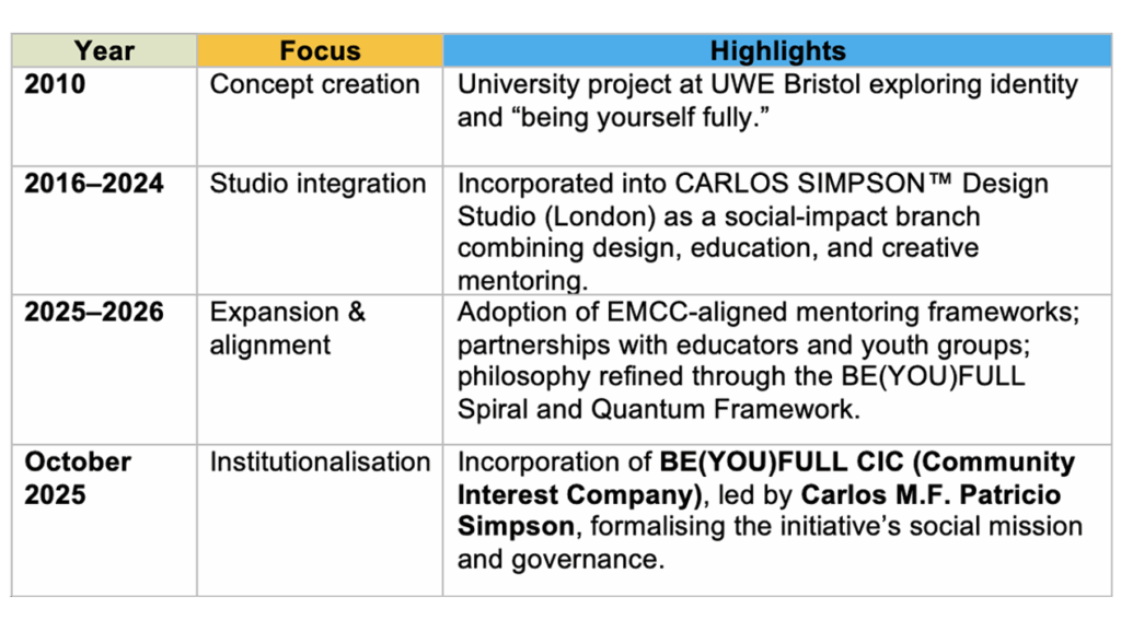
The concept originated in 2010 as a graphic design university project by artist and author Carlos Simpson at the University of the West of England (UWE Bristol).
The original project explored the themes of identity, connectivity, and self-expression, proposing that through education and creativity, society could become more empathetic and sustainable.
2. Integration into Carlos Simpson Design Studio (2016-2024)
Following its academic beginnings, BE(YOU)FULL became part of Carlos Simpson Design Studio in London, where it evolved into a creative-social initiative bridging art, design, and human development.
During this stage, the project’s focus expanded from visual communication to include education, community workshops, and social-impact campaigns.
It became a living movement promoting empathy, authenticity, and creative sustainability across artistic and educational contexts.
3. Mission & Strategic Focus
BE(YOU)FULL’s mission rests on three interconnected pillars:
Mentoring & Coaching: Empowering children, young people, and educators through one-to-one and group development.
Education & Capacity-Building: Equipping educators and youth with tools, frameworks, and reflective practices that foster inclusion and growth.
Systemic Impact: Engaging organisations, schools, and leadership networks to shape more equitable, empathetic systems.
4. Key Phases of Development
5. The BE(YOU)FULL CIC
In October 2025, the movement reached a major milestone: the creation of BE(YOU)FULL CIC, a legally recognised Community Interest Company.
This structure safeguards its mission for the public benefit and ensures that all assets are dedicated to advancing education, creativity, and youth empowerment.
BE(YOU)FULL CIC operates mentoring and sustainability programmes that help young people build agency, confidence and self-expression.
It collaborates with educators, schools, and partners across the UK to cultivate mentally healthy communities and foster a culture of empathy and inclusion.
6. Looking Ahead
Today, BE(YOU)FULL represents both a philosophy and an organisation, a synthesis of creative identity and social responsibility.
It continues to grow as a collective of artists, educators, and mentors committed to one shared vision:
“To change the world for a better place, we need to start with education – by supporting educators and children in need.”
From its origins as a design-based inquiry into identity, BE(YOU)FULL has become a transformative platform blending art, education, and human development inspiring people everywhere to live authentically, consciously, and fully.
© 2025 BE(YOU)FULL CIC
Design and Philosophy by Carlos Simpson Design Studio, London